Business process mapping is the practice of working out how a process actually runs — every step, decision and hand-off, and who does each one — and drawing it so the whole team can see it on one page. It is the discovery half of process improvement: before you can standardise, automate or fix a process, you need an honest picture of it, and mapping is how you get one.
This guide is for operations, IT, HR and team leads at companies of 10–500 people who have a process that keeps going wrong, or one that only works because one person carries it in their head, and who need to get it out onto paper in a form that can be improved and handed over. It covers what a process map is, the types you will actually use, the symbols, a seven-step method that works in a two-hour workshop, a worked example, and — the step most guides stop short of — how to turn the finished map into a process that runs.
Mapping is deliberately less formal than its sibling discipline, business process modeling. A map is built in a room with the people who do the work, with markers and sticky notes if necessary, and its first job is agreement rather than precision. If you need formal notation, simulation or automation-grade rigour, read the modeling guide after this one. Most processes in a mid-sized company never need it.
What Is Business Process Mapping?
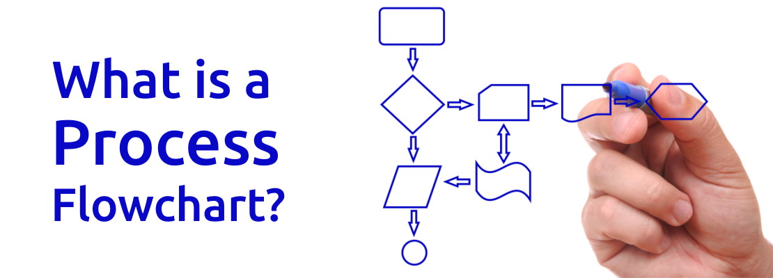
A process map is a visual representation of a business process from its trigger to its outcome: the sequence of activities, the points where a decision sends work one way or another, the people or teams responsible for each part, and the places where work passes from one of them to another. Most process maps are flowcharts or swimlane diagrams, and most of them fit on a single page, which is not an accident. A map that needs three pages is describing three processes.
Mapping is a discovery activity as much as a drawing one. The finished diagram matters, but the more valuable output is often what happens in the room while it is being made: the service desk lead discovers that finance holds purchase requests for a signature nobody has required for two years; the HR coordinator learns that IT has been rebuilding her equipment request in their own spreadsheet because the form does not ask the questions they need. A process that spans three teams has three partial pictures of it, and the map is usually the first time anyone has seen the whole thing.
That is why process maps are built with practitioners rather than for them. The person who runs the step knows the workaround, the delay and the exception. The manager knows the process as it was designed. A map drawn from the manager's description looks tidy and describes a process that does not exist.
Where process mapping came from
Frank and Lillian Gilbreth presented the "process chart" to the American Society of Mechanical Engineers in 1921 as a way of recording every step of a piece of work so that it could be studied and improved. The Gilbreths' argument was that no single step of a process can be changed sensibly until the whole process has been laid out, because every step affects the others. Allan Mogensen's work simplification programmes of the 1930s carried the technique from industrial engineers into general management, and it has been the standard first move in process improvement ever since.
What a good process map answers
A usable map lets someone who has never seen the process answer six questions without asking anyone: What starts this process? What are the steps, in order? Who does each one? Where are the decisions, and what determines the outcome? Where does work pass between people or teams? What does "finished" look like? If the map cannot answer all six, it is a sketch rather than a map, and it will not survive contact with a new starter or an auditor.
Why Map a Process?
Teams map processes for five reasons, and it is worth knowing which one applies before you start, because it changes what the map needs to show.
To find waste and delay
Inside a process, delay is invisible. Each person sees their own step take an hour and assumes the rest is similar. The map shows the eleven days between the hour-long steps: the request waiting in a shared mailbox, the approval waiting for a weekly meeting, the form sent back for a missing field. In lean terms, the map exposes waiting, over-processing, motion and defects — the categories described in our guide to lean manufacturing principles — and it exposes them in service and office processes just as clearly as on a production line. A map that is being built to find waste needs timing on every step and every gap.
To onboard and hand over
When the one person who knows how month-end close works goes on leave, resigns or is promoted, the process leaves with them. A map is the fastest form of hand-over: it shows the new person the shape of the job before they learn the detail of each step. Teams that map their core processes onboard replacements in days rather than months, and they stop depending on individuals for institutional knowledge. A map built for hand-over needs to be complete rather than timed, and it needs the exceptions.
To prove compliance
Auditors under ISO 27001, SOC 2, GDPR or an industry regulator want two things: a defined process, and evidence it was followed. The map is the first. It shows the control points — where access is approved, where a change is reviewed, where a record is retained — and it shows that they sit in the right place in the flow. A map built for compliance needs the control points marked explicitly and the records each one produces named.
To prepare for automation
You cannot automate a process you cannot describe. Every automation effort, from a Zapier connection between two systems to a full workflow platform, starts with a map precise enough to configure from. Mapping first also stops the most expensive mistake in automation, which is automating a broken process and getting the wrong answer faster. Our guide to workflows and how to build one covers the step from map to workflow; a map built for automation needs every decision's conditions and every input named.
To standardise
When five people do the same job five ways, the map is where the team agrees which way is the standard. It is the raw material for the SOP and the checklist that follow. Our guide to process standardization covers what to do once the standard is agreed; the map is how you get to the agreement.
Types of Process Maps
There are more named diagram types than anyone needs. The six below cover almost every situation in a mid-sized company, and the choice between them depends on what question you are trying to answer.
| Map type | What it shows | Best for | Weakness | Typical size |
|---|---|---|---|---|
| High-level map | The five to ten major stages of a process, no decisions, no roles | Orientation; agreeing scope; leadership overview | Hides all the problems | One line of boxes |
| Basic flowchart | Every step and decision in sequence | Single-team processes; procedures with branching | Does not show who does what | 10–30 shapes |
| Swimlane (cross-functional) map | Steps and decisions placed in a lane per role or team | Any process that crosses teams; finding hand-offs | Gets wide fast with more than six lanes | 15–40 shapes, 3–6 lanes |
| Detailed process map | Everything in the swimlane plus inputs, outputs, systems, timings and exceptions | Root-cause analysis; automation design; compliance evidence | Expensive to build and maintain | 40+ shapes, often several pages |
| Value stream map | Flow of work and information with a timeline of value-adding vs waiting time | Lead-time problems; lean improvement | Needs timing data; unfamiliar notation | One page, wide format |
| SIPOC | Suppliers, inputs, process (5–7 steps), outputs, customers, as a table | Agreeing boundaries before mapping | Not a picture of flow at all | One table |
In practice most mapping exercises use two of these. A SIPOC or a high-level map settles the scope in the first twenty minutes, and a swimlane map does the real work. A detailed map is worth the cost only when the swimlane has shown where the problem is and you need to look closer at one section of it. A value stream map is the right tool when the question is specifically "why does this take three weeks" rather than "how does this work".
The swimlane map deserves a specific recommendation. If a process involves more than one team and you draw it as a plain flowchart, you lose the single most useful piece of information a map can give you: where the work changes hands. Every lane crossing is a place where a request can sit in a queue, lose context, or get re-entered into a different system. Draw the lanes.
Process Mapping Symbols
You need very few symbols. The set below is enough for any swimlane or flowchart map, everyone in the room will understand it, and it converts directly into the more formal notations if you ever need them. Our guide to process flowcharts covers the extended set.
| Symbol | Shape | Use it for | Example |
|---|---|---|---|
| Terminator | Oval or rounded pill | The trigger that starts the process and the outcome that ends it | "Change request submitted" / "Change closed" |
| Process step | Rectangle | One activity by one role; verb first | "Assess risk and impact" |
| Decision | Diamond | A question with two or more labelled exits | "Standard change?" Yes / No |
| Document / data | Rectangle with a wavy base | A form, record or file produced or consumed by a step | "Back-out plan" |
| Sub-process | Rectangle with double side borders | A step that has its own map elsewhere | "Run deployment checklist" |
| Delay | D-shape | Work waiting for a person, a meeting or a date | "Wait for weekly CAB" |
| Flow line | Arrow | The order of steps; a line crossing a lane is a hand-off | — |
| Off-page connector | Small pentagon or circle with a letter | Continuing the map on another page (avoid if you can) | "A" |
| Swimlane | Horizontal or vertical band | One role, team or system; everything in the band is theirs | Requester / Service desk / Change manager |
Three habits make a map far easier to read. Write every step as a verb and an object — "approve request", not "approval". Label both exits of every decision, and phrase the question so that "yes" is the common case. And put the delay symbol in wherever work waits, even if it feels like an admission; the delays are what you are looking for.
Skip the Blank Page
CheckFlow's template library contains ready-to-run process templates for onboarding, change management, incident response and dozens of other cross-team processes — each one already broken into ordered, assigned steps you can use as the starting point for your own map.
Browse Free TemplatesHow to Map a Business Process in 7 Steps
The method below is designed to be run as a single workshop of two to three hours for a typical cross-team process, with an hour of preparation before and an hour of tidying afterwards. It assumes a swimlane map, because that is what most processes need, but it works for a plain flowchart with the lanes removed.
Choose the process and state the problem
Pick one process with a clear start and end, not a function. "Handling an IT change request from submission to closure" is a process; "change management" is a programme. Then write down, in one sentence, why you are mapping it: "Changes take a median of nine days to approve and we do not know where the time goes", or "only Priya knows how this works and she leaves in March". The reason decides everything else — what level of detail, whether you need timings, who has to be in the room. Prioritise by frequency, by the number of people involved and by the cost when it goes wrong. A process that runs weekly across three teams and causes a client complaint every month is worth mapping before one that runs annually inside a single team.
Gather the people who do the work
Invite one practitioner from every team that touches the process: the person who actually raises the ticket, triages it, approves it, implements it. Not their managers, or not only their managers. Keep it to six or seven people; beyond that a workshop becomes a meeting. Tell them in advance that the goal is to draw what happens, not what should happen, and that nobody is being assessed. The workarounds and the skipped steps are the point, and people will only volunteer them if they are confident the map is not a disciplinary record. Ask each of them to bring the last two real examples they handled.
Define the boundaries
Before drawing a single step, agree the trigger, the end point, and what is out of scope. A SIPOC table on a flip chart takes twenty minutes and stops the workshop expanding sideways: does change management include the request for a new server, or does that belong to procurement? Does it end at deployment, or at post-implementation review? Write the lanes at this point too — usually four to six roles — and agree what each one is called. Half of all mapping arguments are scope arguments in disguise, and this step has them early and cheaply.
List the steps and decisions
Walk through a real instance from the examples people brought. "Take the last change you raised, Sam. What did you do first?" Write each step on a sticky note as a verb and an object, put it in the right lane, and keep going until the end point. Then walk through a second instance that went differently, and add the decisions and branches that explain the difference. Capture, for each step, who does it, what system it happens in, and — if the reason for mapping is delay — how long the step takes and how long work waits before it. Do not tidy as you go. A wall of sticky notes in roughly the right order is the correct output of this step.
Sequence and draw the map
Turn the sticky notes into a clean map. Put the main path — the way the process goes most of the time — in a straight line left to right, with exceptions branching off and rejoining. Label both exits of every decision. Mark every lane crossing as a hand-off, and put a delay symbol wherever work waits. Number the steps so people can refer to them. This is the moment to do the drawing in a diagramming tool rather than on the wall, but resist the urge to make it beautiful; the version that matters is the one after step 6.
Validate with the practitioners
Give the drawn map back to the people from step 2 and ask them to find what is wrong with it. There will be something: a step that happens in a different order, a decision that is really two, a hand-off that goes to a different person on Fridays. If time allows, have someone who was not in the workshop try to follow the map through a real instance and note where they get stuck. A map that the practitioners have corrected is one they will recognise as theirs. A map that is handed to them finished is one they will quietly stop using.
Analyse and improve
Now interrogate the map against the reason from step 1. Count the hand-offs; each is a queue. Count the decisions; each is a place a request can go the wrong way. Find the loops where work goes back for rework, and ask what information was missing. Add up the delays and compare them with the working time — in most office processes the ratio is the finding. Then choose the two or three changes that address the problem, redraw the affected section as a to-be map, and decide how the new version will be run: as an updated SOP, as a checklist with assigned steps, or as an automated workflow. The map that goes in a drawer at this point has achieved nothing; the map that becomes the process has.
Worked Example: Mapping an IT Change Request
The example below is a composite drawn from IT teams at companies of 80–200 people, and the figures are illustrative rather than measured, but the pattern will be familiar to anyone who has run a change process. The reason for mapping was stated as: "Changes take too long to approve, engineers are bypassing the process for small changes, and we cannot show an auditor that changes were reviewed."
The as-is map
The swimlane map had five lanes: requester (usually an engineer), service desk, change manager, the change advisory board (CAB), and implementer. The trigger was "change request raised", which turned out to happen three ways — a ticket, an email to the change manager, or a message in the engineering chat channel — and the first finding was that only the ticket route produced any record.
The main path ran: service desk triages the ticket and assigns it to the change manager (hand-off one); the change manager assesses risk and impact and adds it to the CAB agenda; the request waits for the weekly Tuesday CAB (a delay of anything from one to seven days, median three and a half); CAB approves, rejects or asks for more information; approved changes go back to the requester to schedule (hand-off two); the implementer makes the change; and the ticket is closed. Two decisions appeared: "approved?" at CAB, and "more information needed?", which sent about a quarter of requests back to the requester and onto the following week's agenda — a loop that added a full week each time it fired.
Three things were missing from the official picture and present on the wall. There was no step for a back-out plan, so CAB asked for one verbally in about half of cases, which was the main cause of the "more information" loop. There was no step for communicating the change to affected users; it happened when the implementer remembered. And the closure step recorded that the ticket was closed, not that the change had been verified as successful, so the audit trail stopped at "we did it" rather than "it worked". The count: 11 steps, 4 hand-offs, 2 decisions, 1 loop, 1 significant delay. Roughly 40 per cent of requests were routine, pre-approved-in-principle changes — patching, certificate renewals, standard account changes — that went through exactly the same path as a database migration.
The to-be map
The redesign kept the lanes and added a decision at the very front: "standard change?" A defined list of standard change types now takes a short path — the requester completes a pre-approved checklist for that change type, the implementer executes it, and it is closed with verification — with no CAB and no change manager review, but with a full record. That removed the weekly delay for the routine 40 per cent and removed the incentive to bypass the process, since the compliant route was now faster than the chat message.
For normal changes, the risk and impact assessment moved into the request form itself, along with a mandatory back-out plan field and an affected-users field, so the change manager receives a complete request instead of chasing one. The "more information" loop was reduced to the genuinely unclear cases. A "notify affected users" step was added to the implementer's lane with an owner and a due date relative to the change window. Closure became a two-part step: implement, then verify against the success criteria written in the request, then close.
Emergency changes got their own short branch with retrospective CAB review, so that the process had an honest path for the case that previously went through chat. The to-be count: 13 steps, 3 hand-offs, 3 decisions, 0 loops on the standard path, and a delay that now applies only to normal changes. The projected median approval time for normal changes fell from about nine days to under four, with the remaining time being the CAB cadence itself — which the team then agreed to move to twice weekly.
What the map found that the interviews did not
Every one of the three missing steps — back-out plan, user communication, verification — was known to someone in the room, and none of them was in the documented process. The three ways of raising a request, and the fact that only one of them left a record, was news to the change manager. None of this needed BPMN, simulation or a process mining tool. It needed the right six people, a wall, and two and a half hours.
Our IT change management checklist guide shows the to-be version of this process as a running checklist, with the standard/normal/emergency classification handled by conditional logic rather than three separate documents.
From Process Map to Executable Checklist
A map describes a process. It does not run it. The change process above was mapped well and redesigned sensibly, and it would have drifted back to the chat channel within a quarter if the to-be map had been published as a PDF and left there. The last step of mapping is converting the map into something that executes: for most mid-sized teams, that means a checklist with assigned steps and dates, run from a template every time the process is triggered.
The conversion is close to mechanical, which is one of the reasons to map with swimlanes and labelled decisions in the first place. Each step becomes a task. Each lane becomes the role the task is assigned to. Each decision becomes a question whose answer shows or hides the tasks on each branch — the mechanism described in our guide to conditional logic in checklists. Each delay that was really a deadline becomes a due date relative to the trigger or the change window. Each document symbol becomes a field the task requires before it can be completed. The trigger becomes the thing that creates a new run: a form, a schedule, or an event in another system.
Before converting, check the map is ready:
- Every step starts with a verb and belongs to exactly one lane that maps to a real role in the organisation
- Every decision has labelled exits that do not overlap and between them cover every case
- Every hand-off has a named receiving role, not "the team"
- Every delay has been classified as either a deadline (becomes a due date) or a queue (becomes a task the platform can show as waiting)
- Every document or data item has a name and a step that produces it
- Any step with more than about eight sub-steps has its own sub-map, which will become a section or a sub-checklist
- The trigger is something a system can detect, and the end point is something a person can confirm
- Someone owns the map, and it has a version number and a review date
Once it is running, the process starts generating its own data: how long each step actually takes, which branch each run took, where work stalls. That data is a far better as-is map for the next improvement round than another workshop, and it is the basis of the continuous improvement loop that mapping is supposed to start. The recurring checklists guide covers what changes when a process runs on a schedule rather than when someone remembers.
Common Business Process Mapping Mistakes
Mapping is simple enough that most failures are avoidable, and the same handful account for nearly all of them.
Mistake 1: Mapping the designed process instead of the real one. The manager describes the process as it was set up; the practitioners run it as it has become. A map built from the manager's description is a to-be map with the wrong label, and improvements based on it fix problems that do not exist. Walk through real instances with the people who do the work, and treat every "well, officially..." as the start of the actual answer.
Mistake 2: Mapping the whole department. A map of "finance" or "IT operations" is a map of nothing. It will be enormous, it will take months, and it will be out of date before it is finished. Map one process with a clear trigger and end point, improve it, run it, then map the next. A dozen one-page maps beat one wall chart.
Mistake 3: Happy path only. The main path is usually the part everyone already agrees on. The value is in the branches: what happens when the approver is away, when the request is incomplete, when the change fails. A map with no decisions and no loops is describing how the process would work if nothing ever went wrong, which is not a process anyone runs. Ask "and what if that doesn't happen?" at every step.
Mistake 4: No lanes. A cross-team process drawn as a plain flowchart hides the hand-offs, which are where most of the delay and most of the errors live. If more than one role touches the process, draw the lanes. The moment you can see eleven lane crossings in a process that should need four, you have found the problem without measuring anything.
Mistake 5: Making it beautiful before making it right. Teams spend the workshop's second hour aligning boxes in a diagramming tool while the practitioners drift off. The wall of sticky notes is the map until it has been validated. Draw it cleanly after step 6, not during step 4.
Mistake 6: Filing the map. A validated, improved, approved process map that is exported to PDF and stored in the process library has changed nothing. The process still runs the way it did, and within a year the map and reality have diverged again. The map is a design for something that has to be built — a checklist, a workflow, an SOP and a retrained team — and the build has to be planned from the start. A map without an owner and without an executable version is a photograph, not a control.
Process Mapping Tools
The tool matters less in mapping than in almost any other process discipline, because the important work happens in the room, and the categories below are more useful than any product comparison. Most teams need something from the first group and something from the last.
Paper, walls and sticky notes
Still the best tool for the workshop itself. A roll of brown paper on a wall, lanes drawn in marker, one sticky note per step, a different colour for decisions. Everyone can reach it, everyone can move things, and nobody is waiting for the person with the laptop to find the right shape. Photograph it at the end.
Diagramming and whiteboarding tools
General-purpose diagramming applications with flowchart and swimlane shape libraries, and online whiteboards that replicate the sticky-note workshop for remote teams. This is where the validated map gets drawn cleanly, versioned and shared. They are cheap, familiar and entirely sufficient for mapping; their limitation is that they produce a picture, not a running process.
Modeling and process mining tools
Dedicated BPMN suites and process mining platforms belong to business process modeling rather than mapping. They enforce a formal notation, or reconstruct the as-is from system logs, and they suit regulated organisations and high-volume processes. For a team mapping a change process or a client onboarding process for the first time, they add cost without adding insight.
Execution platforms
Business process management software that runs the mapped process: creates an instance when the trigger fires, assigns each step to a named person, enforces order and branching, records who did what and when, and shows every active instance on a dashboard. This is the category that turns the map into an operational control. Some execute BPMN directly; most, including CheckFlow, use a checklist model that is faster to build and easier for non-specialists to maintain, and that a validated swimlane map converts into almost line by line. Our guide to business process management covers what to look for in this category.
Free Process Templates to Start From
Each template below is a cross-team process already broken into ordered, assigned steps with its decision points built in. Use one as the to-be target for your own map, or work backwards from it to a swimlane if you would rather see the structure before the detail.



The full template library covers onboarding, offboarding, change and incident management, month-end close and recurring compliance work. Every template can be edited in the template designer to match the map you have just validated, and our client onboarding checklist guide walks through a full mapped-then-run example for a services team.
How CheckFlow Fits
CheckFlow is where a validated process map goes to run. It does not draw swimlanes; it takes the lanes, steps, decisions and deadlines from your map and turns them into a template that creates a tracked, assigned run every time the process is triggered.
Each lane becomes a role or a named person on the tasks in that lane, so that when a change request run starts, the assessment lands in the change manager's queue and the implementation in the engineer's, rather than in a shared inbox. Steps become tasks in order, with dependencies where the map showed one step waiting on another. Decisions become conditional logic: the "standard change?" question at the top of the run shows the short path or the full CAB path, so a single template replaces three documents and the process has an honest route for every case.
Deadlines from the map become dynamic due dates — a fixed number of days after the run starts, or relative to a key date captured in the run such as the change window or a client's go-live date. Processes that run on a cadence become recurring schedules: a month-end template set to start on the first working day creates itself, assigned and dated, without anyone copying last month's. Triggers from other systems arrive through Zapier or the API, so a ticket in your service desk or a new record in your CRM can start a run directly.
Every run keeps a complete audit trail of who completed each task, when, and with what data — the evidence an auditor asks for after the map has shown them the control points. The real-time dashboard shows every active run, with overdue tasks surfaced, so the operations lead sees the onboarding that has stalled in finance without asking. And because every run is timestamped, the platform produces the next as-is map for you: real step durations, real branch frequencies, real stall points, ready for the next improvement round.
CheckFlow's business process management software starts from $10 per user per month, with a 14-day free trial and no credit card required.
Turn Your Process Map Into a Running Process
Build your validated map as a CheckFlow template with assigned steps, conditional branches and due dates driven by your key dates. Run it, measure it, and improve it from real data instead of another workshop.
Start free trialFrequently Asked Questions
What is business process mapping?
Business process mapping is the practice of discovering how a process actually runs — its steps, decisions, roles and hand-offs from trigger to outcome — and drawing it, usually as a flowchart or swimlane diagram, so the whole team can see and agree on it. It is done with the people who perform the work, using real examples, and its first output is shared understanding rather than a formal document.
Teams map processes to find waste and delay, to hand over and onboard, to prove compliance, to prepare for automation and to agree a standard way of working. The map is then improved and, ideally, converted into a running checklist or workflow so that the improvement sticks.
What are the 7 steps of process mapping?
Choose one process and state the problem you are solving; gather the people who actually do the work; define the boundaries — trigger, end point, scope and lanes; list the steps and decisions by walking through real instances; sequence them and draw the map with labelled decisions and marked hand-offs; validate it with the practitioners and fix what they find; then analyse it against the original problem, redesign the to-be, and decide how the new version will be run.
For a typical cross-team process this fits in a single workshop of two to three hours plus an hour of preparation and an hour of tidying. The seventh step is the one most teams skip, and it is the one that makes the other six worthwhile.
What is the difference between process mapping and process modeling?
Mapping is the informal, collaborative discovery of how a process works, drawn in a notation everyone in the room can read. Modeling takes that map and makes it rigorous: a formal notation such as BPMN 2.0, explicit conditions on every decision, exception paths, and often timing and volume data, so the process can be analysed in detail, simulated or executed by software.
Mapping comes first and takes hours; modeling follows, when it is needed at all, and takes days. Most processes in a company of 10–500 people need a map and a checklist and never need a formal model. Modeling earns its cost when a process crosses many teams, has complex decision logic, or is being automated at scale.
What is a swimlane diagram?
A swimlane diagram, also called a cross-functional flowchart, is a process map divided into horizontal or vertical bands, one per role, team or system. Every step is placed in the band of whoever performs it, so the diagram shows not only what happens but who does it, and every arrow that crosses a band boundary is a hand-off between people.
It is the most useful map type for any process that involves more than one team, because hand-offs are where work waits, loses context and gets re-entered into different systems. A swimlane map makes every one of them visible, and the count of lane crossings is often the single most telling number a mapping exercise produces.
What symbols are used in a process map?
A working process map needs very few: an oval for the start and end, a rectangle for each step, a diamond for each decision with both exits labelled, a document shape for forms and records, a rectangle with double side borders for a sub-process that has its own map, a D-shape for a delay, arrows for flow, and swimlanes to show who does what.
Consistency matters more than the number of symbols. Write every step as a verb and an object, phrase decisions so that "yes" is the common case, and put the delay symbol in wherever work waits. If you later need a formal notation, this small set converts directly into BPMN.
Who should be involved in process mapping?
One practitioner from every role that touches the process — the people who raise, triage, approve, perform and close the work — plus a facilitator who owns the map and, ideally, a manager with the authority to change the process once the map has shown what needs changing. Keep the group to six or seven; larger workshops become meetings.
The practitioners are essential because they know the workarounds, delays and exceptions that managers do not. They will only share them if the workshop is clearly about drawing what happens rather than assessing who does it, so say so at the start and mean it.
What do you do with a process map once it is finished?
Analyse it against the reason you mapped it — count hand-offs, decisions, loops and delays — and redesign the parts that cause the problem. Then convert the to-be map into something that runs: an updated SOP for the individual steps, and a checklist or workflow with assigned tasks, conditional branches and due dates for the process as a whole. Give the map an owner, a version number and a review date.
A map that is exported to PDF and filed changes nothing; the process drifts back within months. A map that becomes the template the team runs from every time generates its own data on every run, which is the starting point for the next round of improvement.