Somebody spends the first two days of every month copying numbers into a slide deck. How many onboardings did we finish? How long did they take? Who is behind? The figures are a snapshot, they are hard to reproduce, and the effort goes into assembling the report rather than acting on what it says. By the time it is presented, it is already out of date.
Most teams know a process is "a bit slow" or "always late". Very few can say by how much, since when, or which step is responsible. Without a cycle-time number there is no baseline, and without a baseline there is no way to tell whether a change made things better or worse. Every process has one step that drags the whole thing out, and when the process lives in email and spreadsheets that step is invisible: you see that the checklist finished late, not which task caused it.
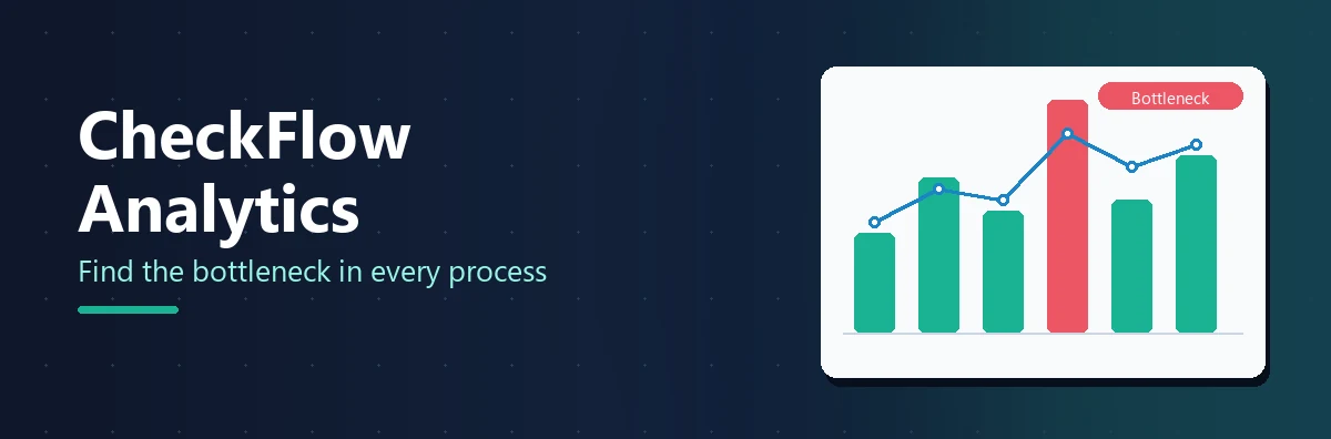
CheckFlow Analytics is a single, filter-driven dashboard that measures how your checklists and tasks are performing across the whole team. Pick a date range, a set of templates, users or tags, and every card, chart and table on the page updates to show how those processes actually performed. This guide walks the dashboard top to bottom, defines every metric on it, shows how to answer twelve concrete questions with it, and ends with a monthly review routine that takes half an hour instead of two days.
Reports, Analytics or Template Analytics?
Three places in CheckFlow show you what has happened, and they answer different questions. Getting this straight first saves a lot of hunting.
| Answers | Works on | |
|---|---|---|
| Reports | Which checklists are in this state, and what did people answer? | Individual checklists and their control values |
| Analytics | How are we doing over time, and where are the bottlenecks? | Aggregated trends across checklists |
| Template Analytics | How is this one template performing? | A single template, in the Library |
Use Reports to find, list and export individual checklists. Use Analytics to spot a trend. Use Template Analytics when the question is about one process rather than the team. The rest of this article is about the middle row, with a section on the third near the end.
The Filter Bar
Click the Analytics icon in the left navigation and the dashboard opens showing the last 30 days across all templates, all users and all tags. The filter bar at the top controls every section beneath it:
| Filter | What it does |
|---|---|
| Period Start / Period End | The first and last day to include, inclusive. Defaults to 30 days ago and today. |
| Templates | Limit the dashboard to one or more templates. |
| Users | Limit to activity involving one or more people — as assignee or as the person who completed the task. |
| Tags | Limit to checklists carrying one or more tags, whether the tag is on the checklist itself or on its template. |
Templates, Users and Tags are multi-select dropdowns with a search box and Select All / Deselect All. Leaving one empty means no restriction: an empty Templates filter reports on all templates, not none. Within a filter, values are OR'd; across filters they are AND'd, so one template and one user shows only that user's activity within that template. Change anything and click the green Apply; every section recalculates together, so the whole page always reflects one consistent set of filters. Reset puts everything back to the defaults.
The period is interpreted in your local time zone, running from midnight at the start of the first day to the end of the last, and matched against data stored in UTC behind the scenes. So you always see a full day's activity for both ends of the range, expressed in your own hours, and a checklist completed at 5pm in your office shows as 5pm.
Drilling down by clicking
You can apply filters without touching the bar at all. In the By Template and By User tables, each row is clickable: click a template row and that template is added to the Templates filter; click a user row and that person is added to the Users filter. Drill-downs stack, so you can click a template, then a user, and see that person's activity within that process. To undo one, remove the item from the dropdown or click Reset.
Standalone tasks and the filters. A standalone task that is not attached to a checklist has no template and no tag, so selecting anything in Templates or Tags drops these tasks out of the dashboard entirely. A task attached to a checklist follows that checklist instead. To compare template activity against one-off work, leave Templates and Tags empty and read the Standalone Tasks row in the By Template table.
The Six Summary Cards
Directly beneath the filter bar sits a row of six headline figures, each with a sub-figure underneath. They are the fastest way to see whether a process is on track before you dig into the charts.
| Card | Main figure | Sub-figure |
|---|---|---|
| Checklists Started | Checklists started during the period | — |
| Checklists Completed | Checklists that reached a completed state | % completion — completed as a share of started |
| Avg Cycle Time | Average time from a checklist starting to completing | — |
| Tasks Completed | All tasks completed, on time and late | % on time — the share completed on or before their due date |
| Tasks Overdue | Tasks currently past their due date and not complete | % of tasks — the overdue share of all tasks in scope |
| Completed Late | Tasks completed after their due date | Avg turnaround — the average time taken to complete a task |
Two things to read carefully. Tasks Completed counts all completions, on time and late, while Completed Late counts only the late ones — so the late count is a subset of the completed count, not an addition to it. And time values are shown in a friendly format: under 24 hours in hours (6.5h), 24 hours or more in days (2.3d), and a dash where there is not enough data to calculate.
Cycle time is the number most teams have never had. It is the elapsed time from a checklist being started to being completed, averaged over every checklist in the filtered period, and it is the measure of how long your processes actually take end to end. Compare the cycle time of one template against another, or the same template this quarter against last, and you have a baseline for the first time.
Activity Over Time
Below the cards, a line chart plots the volume of checklist and task activity across the period. Five lines share the chart on two scales, so the shapes are comparable even though there are usually far more tasks than checklists: on the left axis, Tasks Completed, Tasks Completed Late and Tasks Overdue; on the right axis, Checklists Started and Checklists Completed. Hover over any point to see the exact values for every line on that date.
A Day / Week / Month toggle in the corner re-groups the same data instantly without changing your filters. Weeks start on Monday, and week and month views add up the daily values in each bucket. Two shapes are worth learning to spot:
- Rising Overdue or Completed Late lines mean work is slipping behind schedule. Drill into the By User or Bottleneck Tasks breakdowns to find the cause.
- A widening gap between Checklists Started and Checklists Completed means work is being created faster than it is being finished, which is the earliest visible sign of a backlog.
Overdue tasks are placed on the chart by their due date and completions by their completion date, so a spike in the red line on a Monday means a lot of things fell due that Monday, not that they were noticed then. For long ranges, switch to Week or Month to see the direction rather than the noise.
Breakdowns: Template, User, Bottleneck
The three breakdowns turn the summary cards into comparisons, so you can see which templates, people and tasks are driving the headline numbers. Each is a full grid you can sort, search, page and export.
By Template
A bar chart of Started versus Completed for each template, followed by a table with Template, Started, Completed, Completion %, Avg Cycle, Tasks and Overdue %. This is where "which process takes longest?" is answered: sort by Avg Cycle. Click any row to drill into that template.
At the bottom of the table sits a Standalone Tasks row. Unattached standalone tasks belong to no template, so they are grouped here, with Tasks and Overdue % counted as normal and a dash in the checklist columns, because they have no checklists. The row exists so the task figures reconcile with the summary cards; without it those tasks would be in the headline numbers but missing from every template. It is not clickable and is left out of the bar chart. A task attached to a checklist is not in this row: it is reported under that checklist's template, dated by the checklist rather than by its own creation.
By User
Task activity and timeliness for each team member, both as the person a task is assigned to and as the person who completes it: User, Assigned, Completed (on time), Completed Late, On Time %, Overdue and Avg Turnaround. Assigned and Overdue count the tasks a person is assigned to; Completed, Completed Late and Avg Turnaround count the tasks they completed, which need not be the same tasks. Click any row to drill into that person.
Bottleneck Tasks
The individual tasks that are most often late or overdue: Task, Template, Occurrences, Completed, Late, Overdue and Late / Overdue %. Rows are grouped by the task as it is defined on the template, so one row covers every run of that checklist, and the table is ordered by late plus overdue. A high Late / Overdue % on a task that occurs frequently is a strong signal that the step needs attention — more time, clearer instructions, a different assignee. A standalone task exists only once, so it always has Occurrences of 1 and appears as a row of its own, under its checklist's template where attached and under Standalone Task where not.
Bottleneck Tasks is the table that turns "this process feels slow" into a specific task you can fix. It is not clickable for drill-down; to investigate a task further, filter by its template and read the Tasks detail grid.
Detail Tables
The two grids at the bottom show the individual rows behind the numbers, respecting your current filters. Checklists lists every checklist started within the period, with its template and version, started and completed times, and status. Tasks lists the tasks within those checklists — Task, Status, Due, Completed, Completed By, Assignees and Checklist. A task attached to a checklist names that checklist followed by "(attached)", and a task attached to nothing reads "Standalone".
The detail grids can run to tens of thousands of rows for a busy team over a wide date range, and only the rows on the current page are drawn at once to keep the page responsive. Each grid has its own search box, which filters the rows on screen without changing the dashboard filters. If a grid is slow to load, narrow the date range or pick specific templates.
Export
Above every breakdown and detail grid sits the same row of buttons: Copy puts the grid on your clipboard for a quick paste into an email or chat; CSV and Excel download it for further analysis or as a row-level extract; PDF downloads a landscape document; Print opens a printer-friendly version. Exports contain the grid's current data under your active filters. On narrower screens some buttons are hidden to save space; widen the window to reveal them.
Each grid exports on its own — there is no single whole-dashboard export and the charts are not exported, so for a board pack, screenshot the trend chart and export the tables beneath it.
The Metric Definitions
Every number on the dashboard is defined precisely, and knowing the definitions is what lets you defend a figure in a meeting.
| Metric | Definition |
|---|---|
| Checklists Started | Checklists started within the period. |
| Checklists Completed | Checklists that reached a completed state. |
| Completion % | Checklists Completed ÷ Checklists Started. |
| Avg Cycle Time | Average elapsed time from a checklist being started to being completed. |
| Tasks Completed | All tasks completed, including those completed late. |
| Tasks Completed Late | Tasks completed after their due date had passed. |
| Tasks Overdue | Tasks currently past their due date and not yet complete. |
| On Time % | Tasks completed on or before their due date ÷ all completed tasks. A task with no due date counts as on time. |
| Overdue % | Tasks Overdue ÷ total tasks. |
| Avg Turnaround | Average time taken to complete a task, measured from its checklist's start. |
| Occurrences | How many times a template task appeared across the matching checklists. |
| Late / Overdue % | (Late + Overdue) ÷ Occurrences, for a bottleneck task. |
A completed task is counted as either on time or late, never both. On time means completed on or before its due date, or it had no due date; late means completed after it. The task statuses in the detail grid are Completed, Completed Late, Marked Complete (a task that was never ticked but whose checklist was completed, counted with Completed), Overdue and Open — a different set from the Tasks grid's eight, so a task that is Due Today on the grid reads Open here until its due date passes.
Per-Template Analytics in the Library
Every template in the Library has an Analytics tab of its own. Click the arrow on the template item to expand it, click Analytics, and the data loads for all team members' runs, not only yours. By default it shows active runs; toggle Show Completed Runs to include the finished history.
It holds two donut charts — Active Runs, breaking down the status of every current run, and All Tasks, the combined completion status across every task in those runs — and two stacked bar charts. Task Status by Assigned User shows each person with tasks on this template and the status breakdown of their tasks, which is how you see who is overloaded or overdue on this one process. Task Completion & Status shows each task in the template and its overall status across all runs, which is how you see which steps consistently cause delays or keep being marked N/A. Four statistics sit beneath: In Progress, Due Soon (checklists with a task due within the next three days), Overdue, and Avg. Completion Time. All the charts share one colour legend: grey Not Started, blue In Progress, orange Due Soon, red Overdue, green Complete, purple N/A.
The team dashboard is for comparing across processes. The template tab is for improving one, and because it sits beside the template's Edit button, the distance from "this step is always late" to changing the step is one click.
See Your Own Numbers
Run a few checklists, open Analytics, and read the cycle time you have never had before. Free trial, no credit card required.
Start free trial See the Analytics FeaturesTwelve Questions, Twelve Answers
Every one of these is a filter, a card or a breakdown. No spreadsheet required.
1. How many checklists did we complete last month?
Set: Period Start and End to the first and last of the month. Read: the Checklists Completed card, and its % completion for how many of those started also finished.
2. Which template takes longest to finish?
Set: a period long enough to include several runs of each. Read: By Template, sorted by Avg Cycle, descending.
3. Which task is the bottleneck?
Set: the template in question, or leave Templates empty for the whole team. Read: Bottleneck Tasks, top row. A high Late / Overdue % on a task with many Occurrences is the one to fix first.
4. Who has the most overdue work?
Read: By User, sorted by Overdue, descending. Click the row to see which templates and tasks it is.
5. Is cycle time improving quarter on quarter?
Set: last quarter; note Avg Cycle Time. Set this quarter; compare. Do it per template in By Template for the processes you changed.
6. Which team is falling behind?
Set: Users to the members of one team. Read: Tasks Overdue and its % of tasks, then repeat for the next team. Tag checklists by team to do it with a single Tags filter instead.
7. How many onboardings are in flight?
Set: Templates to the onboarding template. Read: Checklists Started minus Checklists Completed on the cards, and the Checklists detail grid for the list of them.
8. What was completed late this week?
Set: Period to this week. Read: the Completed Late card, then the Tasks detail grid sorted by Status.
9. Which tag has the most activity?
Set: Tags to one tag at a time — a client, a region, a priority. Read: Checklists Started and Tasks Completed. Tag your checklists by client and this is a per-client activity report.
10. How busy were we each day?
Read: Activity Over Time at Day granularity. Hover for the exact figures on any date.
11. Which runs are still open?
Read: the Checklists detail grid, searched for In Progress. For the full list with next task and assignees, switch to Reports.
12. What do I export for the board pack?
Set: the reporting period. Export: By Template as PDF for the summary, By User and Bottleneck Tasks as Excel for the discussion, and a screenshot of Activity Over Time at Week granularity for the trend.
A Monthly Process Review in 30 Minutes
Here is the two-day report, done in half an hour, as a routine you can run on the first working day of the month.
Set last month and read the cards
Period Start to the first of last month, Period End to the last. Note Checklists Completed with its completion rate, Avg Cycle Time, and Tasks Overdue with its share of tasks. Write those three numbers next to last month's. That is your baseline, and after three months it is a trend.
Check the trend for the shape of the month
Switch Activity Over Time to Week. Is the gap between Started and Completed widening? Did the Overdue line rise in a particular week? A backlog that started in week three has a cause in week three.
Find the bottleneck
Sort Bottleneck Tasks by Late / Overdue %. Ignore anything with a handful of Occurrences; look for the task that ran twenty times and was late in twelve of them. That is the step to talk about.
Drill into the worst template
Click the template's row in By Template. The whole dashboard narrows to it. Read By User for that template to see whether the problem is one person's load or everyone's, and export the Tasks detail grid to Excel for the process owner.
Open the template's own Analytics tab
In the Library, expand the template and open Analytics with Show Completed Runs on. Task Completion & Status shows the same bottleneck step by step, and the template's Edit button is right there.
Change one thing, and write down what
Give the bottleneck task more time, clearer instructions, a different assignee, or split it in two. Record the change and the date. Next month, step 1 tells you whether it worked — which is the whole point of having a baseline.
Getting the Data Out
Three routes, for three needs. From the dashboard, export any grid to CSV or Excel and load it into Power BI, Tableau or any tool that reads those formats, or use PDF and Print for a fixed snapshot. Through the CheckFlow REST API, the analytics endpoint returns every checklist and task in a date range as JSON, so an external model can be refreshed on a schedule; it takes a period start and an optional period end, and standalone tasks flow through it too, dated by their checklist where attached and by their own creation where not. And on the Enterprise plan you can have a dedicated database with direct read-only access, so Power BI or Tableau connect to your data without any export step at all, with custom views built to your requirements and a private API endpoint if you would rather go over HTTP. See the developer page for the API and pricing for Enterprise.
There is no scheduled or emailed report. Analytics is a live dashboard rather than a digest, and the monthly routine above is how most teams get the equivalent.
Who Can See Analytics
Analytics reports on team-wide data — it is not limited to checklists you created or are assigned to — so access is deliberately controlled. Administrators have full access. A Member sees it only when granted the Analytics.Viewer permission, which any Administrator can assign from Team Management. Guests have no access. This lets you open the dashboard to a manager or an operations lead without making them an administrator, and keep it closed to everyone else.
Reporting by Hand vs CheckFlow Analytics
| Reporting by hand | CheckFlow Analytics |
|---|---|
| Cycle time is estimated, if it is measured at all | Cycle time is a summary card for any filtered period |
| The bottleneck task is a matter of opinion | Bottleneck Tasks shows the late step in every process, with the numbers |
| Overdue work is found by exporting and pivoting a spreadsheet | Overdue and late tasks are counted, and listed by user |
| The monthly report takes days to assemble and is stale on arrival | Set the date range, export CSV, Excel or PDF — done |
| No way to compare one process across all of its runs | Per-template Analytics tab covers every run of a process |
| Data reaches Power BI or Tableau by manual export and re-import | REST API, plus Enterprise read-only database access |
Analytics is included on the Business plan at $10 per user per month, or $9 on annual billing — see pricing.
Stop Guessing Which Step Is Slow
Set the filters, read the answer, fix the process. CheckFlow Analytics turns a feeling into a task you can change.
Start free trial Book a DemoFrequently Asked Questions
Who can see Analytics in CheckFlow?
Anyone with the Administrator role, or any Member who has been granted the Analytics.Viewer permission. Members without it, and all Guests, have no access to the Analytics screen. Because Analytics aggregates data across the whole team, this lets you open the dashboard to a manager or an operations lead without making them an administrator.
Can I filter analytics by tag?
Yes. The filter bar lets you combine a date range with templates, users and tags, and the Tags filter matches checklists tagged directly as well as checklists whose template is tagged. Tag your checklists by client, region, department or priority and you can measure that slice of work on its own — cycle time for everything tagged "Enterprise" this quarter, for example. Every card, chart and table respects the tag filter.
What is cycle time?
Cycle time is how long a checklist takes from being started to being completed. CheckFlow shows the average as one of the summary cards for whatever period and templates you have filtered to, in hours under a day and in days above it. Combined with the By Template breakdown it tells you which process is slowest, and combined with Bottleneck Tasks it tells you which step is making it slow.
Can I export analytics to Power BI or Tableau?
Yes, in three ways. Export any grid from the dashboard to CSV or Excel and load it into Power BI, Tableau or any tool that reads those formats. Use the REST API's analytics endpoint to retrieve every checklist and task in a date range as JSON and keep an external model refreshed. Or, on the Enterprise plan, have a dedicated database with direct read-only access so your BI tool connects without any export step.
Is there per-template analytics?
Yes. Every template in the Library has an Analytics tab focused on that one process: an Active Runs donut, an All Tasks donut, a Task Status by Assigned User chart and a Task Completion & Status chart that highlights which steps cause delays, plus In Progress, Due Soon, Overdue and average completion time figures, with a toggle to include completed runs. The team-wide dashboard is for comparing across processes; the template tab is for improving one.
Does Analytics include standalone tasks?
Yes. Unattached standalone tasks are counted in the task cards, grouped into a Standalone Tasks row at the bottom of By Template, listed as their own rows in Bottleneck Tasks, and shown as "Standalone" in the Tasks detail grid, all dated by when the task was created. Selecting any Templates or Tags filter drops them out, because they have nothing to match. A task attached to a checklist is reported under that checklist's template instead.